Mindre is a brain training platform designed for users seeking mental clarity and cognitive growth. My role was to develop a cohesive visual identity, including the app icon and a multi-segment App Store strategy. The goal was to replace the often-overwhelming aesthetic of health apps with a sense of "mental spaciousness".
Market Insights: From Noise to Clarity
Before designing, I analyzed industry leaders like Peak, Elevate, and Lumosity.
The Problem: Many existing solutions rely on hyper-vibrant palettes and cluttered interfaces that can feel overly academic or stressful.
The Solution: Mindre differentiates itself through minimalism, emotional softness, and a meditative user journey.
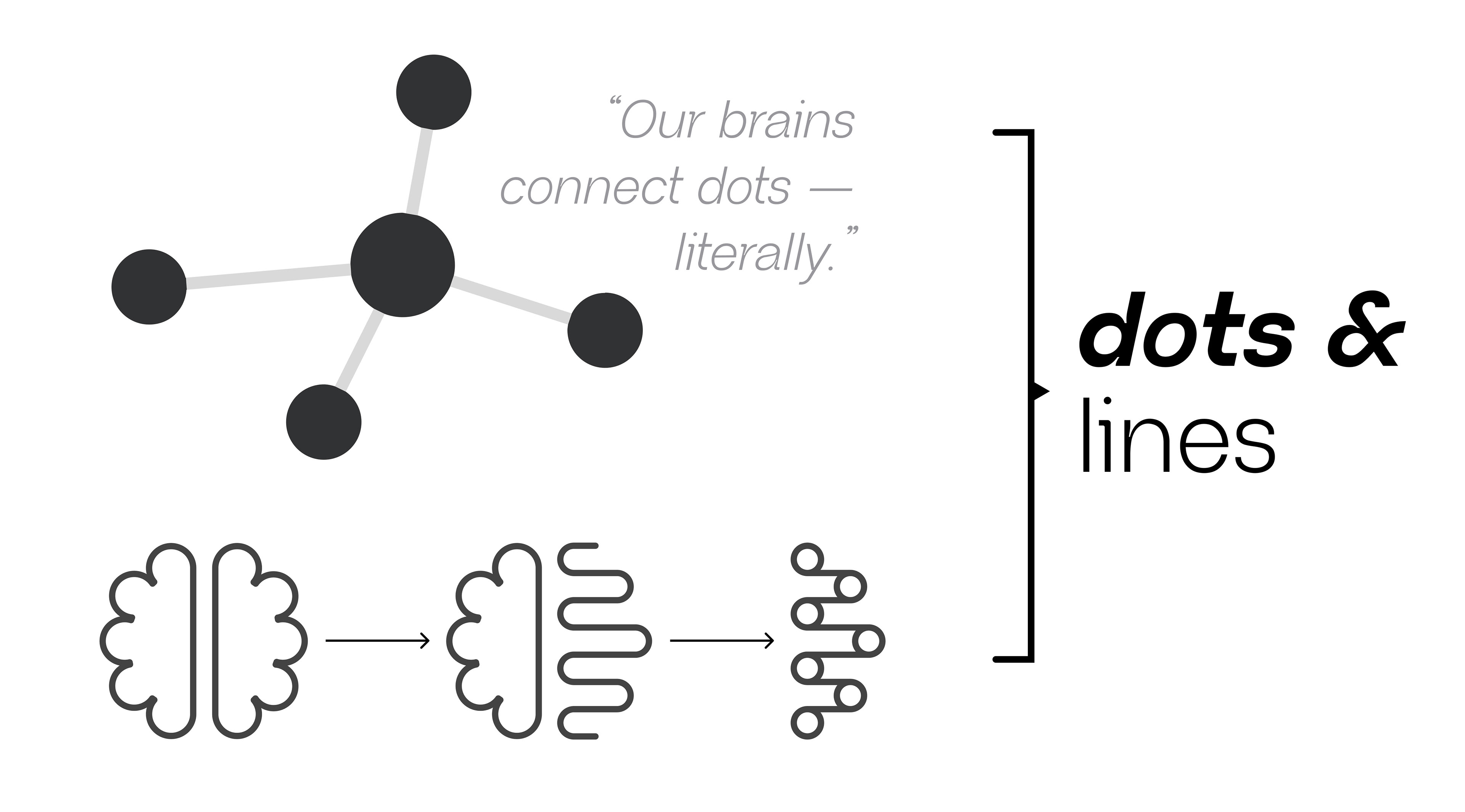
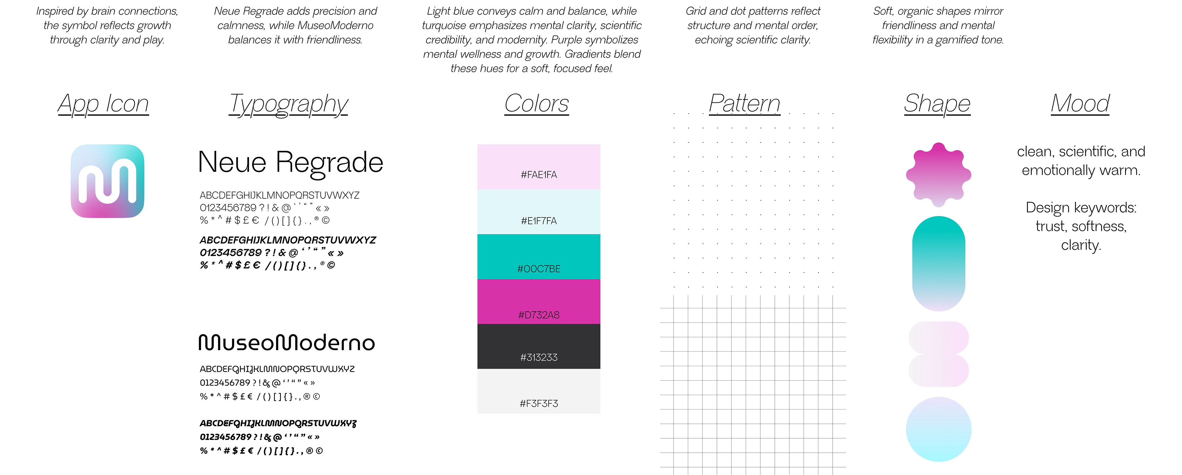
Concept: The Architecture of Thought
The visual foundation is built on "dots and lines," symbolizing neural pathways and the literal connection of ideas within the brain.
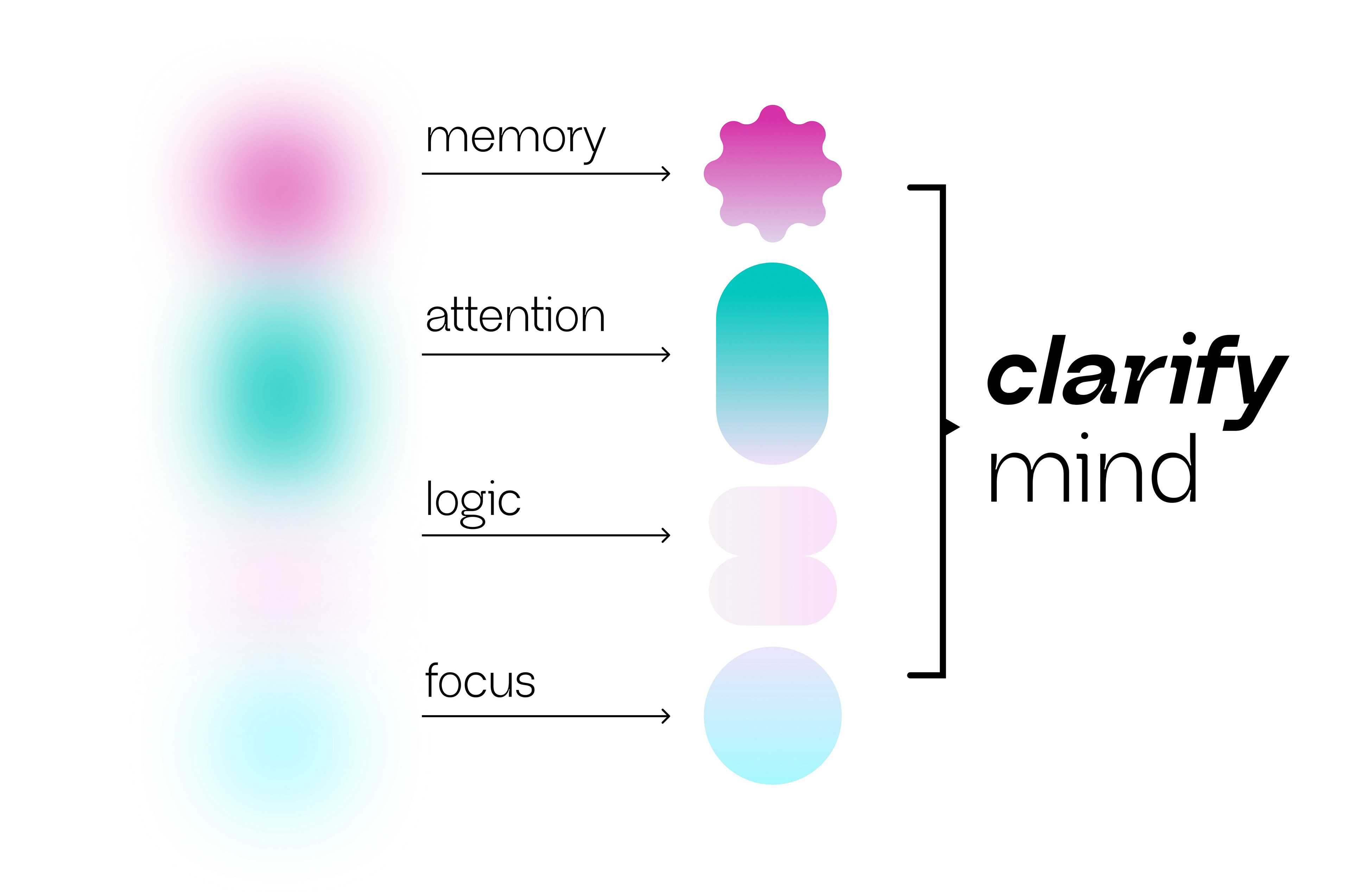
Typography: I paired Neue Regrade for scientific precision with Museo Moderno to maintain a friendly, human touch.
Color Palette: A spectrum of light blue, turquoise, and purple was chosen to evoke trust, mental wellness, and growth.
Visual Language: Soft gradients and organic shapes were used to balance the structure of the "dot patterns" with flexibility and playfulness
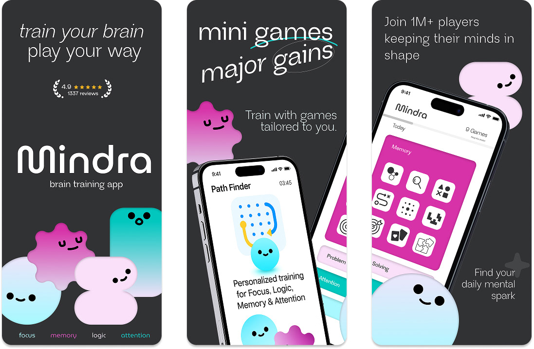
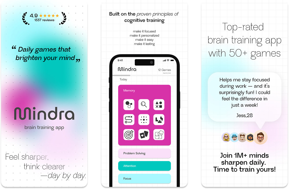
Strategic Segmentation (Visual Communication)
To maximize reach, I developed two distinct App Store visual sets targeting different user psychographics:
Set A (The Professional): Focused on productivity-driven adults, using a clean, gridded layout to build trust and highlight cognitive benefits.
Set B (The Explorer): Tailored for Gen Z and casual gamers, using character-led narratives and energetic contrasts to spark joy and curiosity.